
I love Art Alchemy Paints… what do you think about them?
Hello my Friends!
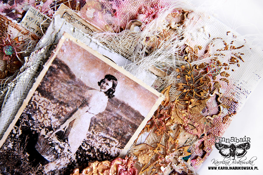
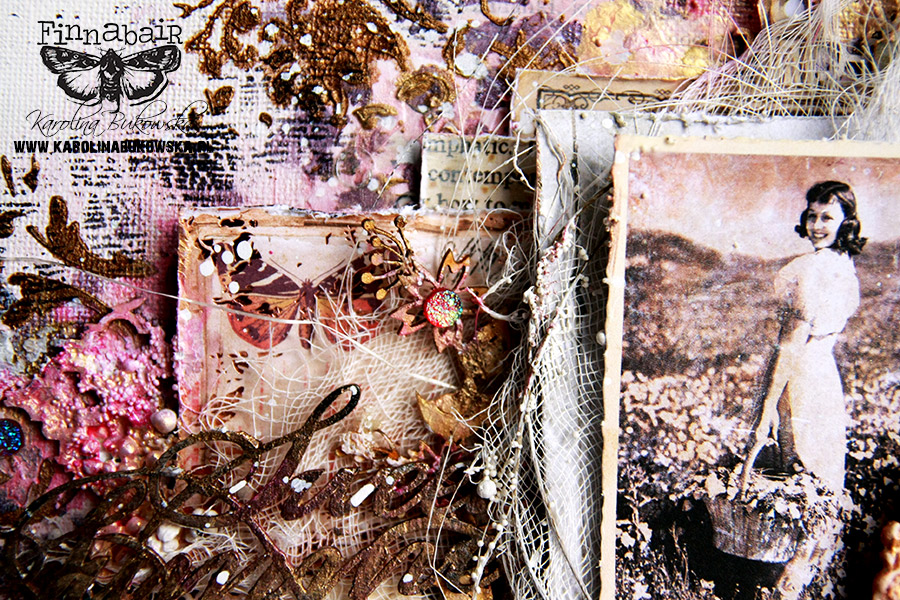
Today I’d like to share a new canvas piece of mine – I wanted to create a work that is very feminine and romantic. I wanted to create a melancholic, romantic atmosphere filled with longing.

While waiting for the spring awakening, I filled my canvas with pieces of lace, gauze, chipboards and the amazing Art Alchemy Acrylic Paints.
Combining them with Art Basics products like Heavy Body Gel or Light Paste you can create some really interesting effects.
All products from Art Basics line can be easily mixed with pigments, paints or mists – the creative possibilities are endless. Don’t be afraid to experiment – the same product will behave differently with Art Basics gel mediums and pastes – just be brave and have fun!
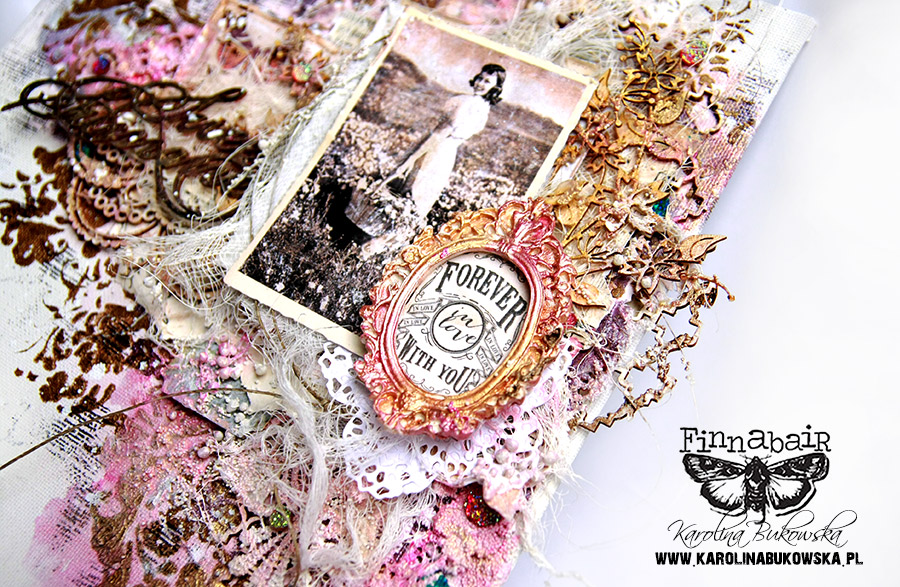
In my project I used this beautiful Metallique Vintage Rose paint applied with Light Paste on a simply white background. With this combination, I received a subtly shiny color.
The same was done with Steampunk Copper paint and I just love the delicate result. Art Alchemy paints have a creamy consistency and they are very easy to application. Art Alchemy – Sparks and Art Alchemy Metallique are metallic and beautifully glistens.
Have I ever mentioned how much I love white backgrounds?
Looking at a blank page or canvas always makes me think of how endless the possibilities are…
What freedom to create, what an immense joy in painting, splashing and smearing paints and all the other media and art supplies…
What freedom to create, what an immense joy in painting, splashing and smearing paints and all the other media and art supplies…
I also played with Art Alchemy paint mixed with Light Paste and applied through the beautiful ‚Lace‚ stencil.
As I’m a huge lover of texture, I added Art Extravagance White Sand Texture Paste and the results were just amazing. This combination created a really great rough surfaces and added so much depth to my background.
I also used this Paste on my chipboard embellishments to make them match the whole look.
A pinch of Art Stones here and there, some freehand stamping, delicate paint splashes – these tiny final touches add so much interest to the whole project!
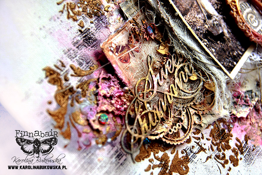
In my compositions I take into account the Gestalt theory of visual perception.
Similar objects similar are connected with each other in color, shape etc. That makes every artwork cohesive.
In my piece such elements are the colors I chose but also crystals, chipboards and the placement of stencil patterns.
Similar objects similar are connected with each other in color, shape etc. That makes every artwork cohesive.
In my piece such elements are the colors I chose but also crystals, chipboards and the placement of stencil patterns.
Let me know if you have any questions and see you again soon.
Have a great creative weekend!
Hugs


